

We’ve also thrown in a bonus 4th statistic at the end of the article on why you should care about mobile-first ecommerce. It’s a bit of a kicker. If you’re about to start on your own ecommerce website development project, this will convince you how important a consideration mobile is.
Before we get to the mobile ecommerce stats, lets recap what happened over the last couple of year.
Due to lockdowns, brick and mortar stores had to face the reality of customers never setting a foot in their premises. There was a rush by businesses to establish an online presence.
Throw up a store. Anywhere. By anyone.
This strategy saw mixed success. Having to compete online against giant retailers (ahem, Amazon), smaller businesses had to bring their best game. That game had to be focused on mobile. It often wasn’t. Newsflash – your ecommerce strategy still needs to have a mobile first approach.
What is mobile first?
Mobile first means your website it designed to look good and perform smoothly on phones from the beginning, and then adapted to also look good on the desktop. Phones aren’t as powerful as laptops and desktops. So if it performs well on phones you don’t need to worry about the rest. So you want your a mobile first website and you want to be a mobile first business.
Stat Number 4 demonstrates why this is important. But first, Stat Number 1.
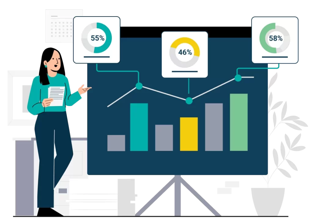
Stat Number 1 – Page Views On Mobile
55% of page views come from mobile phones.
More than half the traffic to a business’s online store could be originating from mobile. Of course this changes from industry to industry, but the number is only going to get bigger for everyone.
With over half the traffic coming from mobile, businesses need to ask, did half of their design budget, their coding budget, go towards building their mobile experience? These are not second rate citizens you slap on a responsive design and hope it boosts sales a few percentage points.
On average, this 55% of pageviews will end up being almost 50% of revenues (as will be revealed below).
If businesses don’t build their online stores mobile-first, they can miss out on those revenues.
Mobile-first means more than a design that fits into the vertical format of a phone screen. Performance is a huge part of the experience. Due to bandwidth and CPU constraints, an ecommerce store that looks slick and performs well on the desktop can look good on mobile but be too slow to load and too sluggish to use.
Google Pagespeed Insights uses a simulated mid-tier mobile phone on a mobile network to measure site performance. It uses the results when deciding how high up to rank sites in their search results.
A mobile-first approach takes performance on mobile as well as design into the overall UX process.
Stat Number 2 – The Purchase Process

46% of consumers complete their entire purchase process
(from research to payment) on mobile.
This statistic, more than any of the others, points to how important mobile is becoming. It is a snowball effect. More powerful phones with bigger displays have made shopping online via a phone more pleasant. The constant growth of mobile traffic has led to new websites always launching mobile capable (if not mobile-first) in order to capture that traffic. And with websites always growing more enjoyable to use on mobile, mobile traffic is capturing more and more of the purchase funnel.
One of the most important ease–of-use changes is the introduction of one-click payments. Digital wallets like Apple Pay and Google Pay, as well as payment service providers like Stripe and Adyen, are creating a new class of customers who are comfortable making online purchases on their mobile phone. One-click payment options remove most of the hurdles to completing payments.
Stat Number 3 – Closing the sale

58% of all multi-device purchases use mobile to close the sale.
There are different ways to interpret this big number. It could be that the digital wallet integration in mobile phones makes completing a purchase on that device the easiest option. It could be that people research purchases on a laptop or desktop, but make the final decision and complete the purchase somewhere more comfortable and conducive to decision making.
There’s probably dozens of scenarios that lead to this result. But they all point to the importance of streamlining the purchase process on your website. It probably means integrating more payment options. It definitely means making sure your website works smoothly across a range of handsets.
On a more technical level, making it easy to share a shopping cart between desktop and mobile experiences will help land more multi-device purchases. This can be by having a very simple sign-up process or being able to capture or send QR codes to access the transaction on another device.
The Kicker Stat – Customers are picky
40% of users will go to the competitor after a bad mobile experience.
That pretty much says it all. More than half your traffic will come via mobile. You can lose almost half of it, or about 25% of your total potential traffic and revenue, if the mobile experience of your website isn’t good enough.
The biggest problem, the one that sends most people away, is websites loading slowly on mobile. Those beautiful hero images that fill your desktop browser window don’t load as fast on a phone. Maybe they do on your iPhone 13 Pro Max. On wifi. But that’s not going to be your mobile audience. It’s also a symptom of building your website desktop-first instead of mobile-first.
How to build mobile-first to maximise mobile revenues

There are no big secrets. It’s a mix of careful design, strategic coding, and backend resources. The two most popular starting points for our clients’ ecommerce websites are WooCommerce and Shopify. They both provide strong options for delivering a mobile experience to your customers.
Shopify is easy to get up and running, and with a careful design and use of resources can be quite performant. But there are limits to what you can tweak. While the ease-of-use makes getting your business online in a reduced time frame possible, you might find the lack of control of the backend keeps you from maximising your customers’ experience.
WooCommerce is infinitely tweakable. As it is built on the open source WordPress CMS you are in control of the entire stack including the backend. This gives you many more choices in optimising delivery of your website to mobile. It does require more of an initial investment, but many clients feel the control and the power on tap it provides is worth it.
Taking your online business mobile-first
If your current ecommerce website isn’t mobile-first, it is always possible to make the necessary frontend changes to fix that. Making changes to the backend will depend on how your site is being hosted.
If you are setting out on creating a new ecommerce website, then you are in the perfect position to ensure that mobile-first informs your tech choices, your design choices and your overall strategy.
If you have any questions about how your business can make the move to mobile-first or how you should build for mobile-first, drop us an email and we’ll get in touch for a chat.


